
Mintlify
The genuine design.md file published by Mintlify.
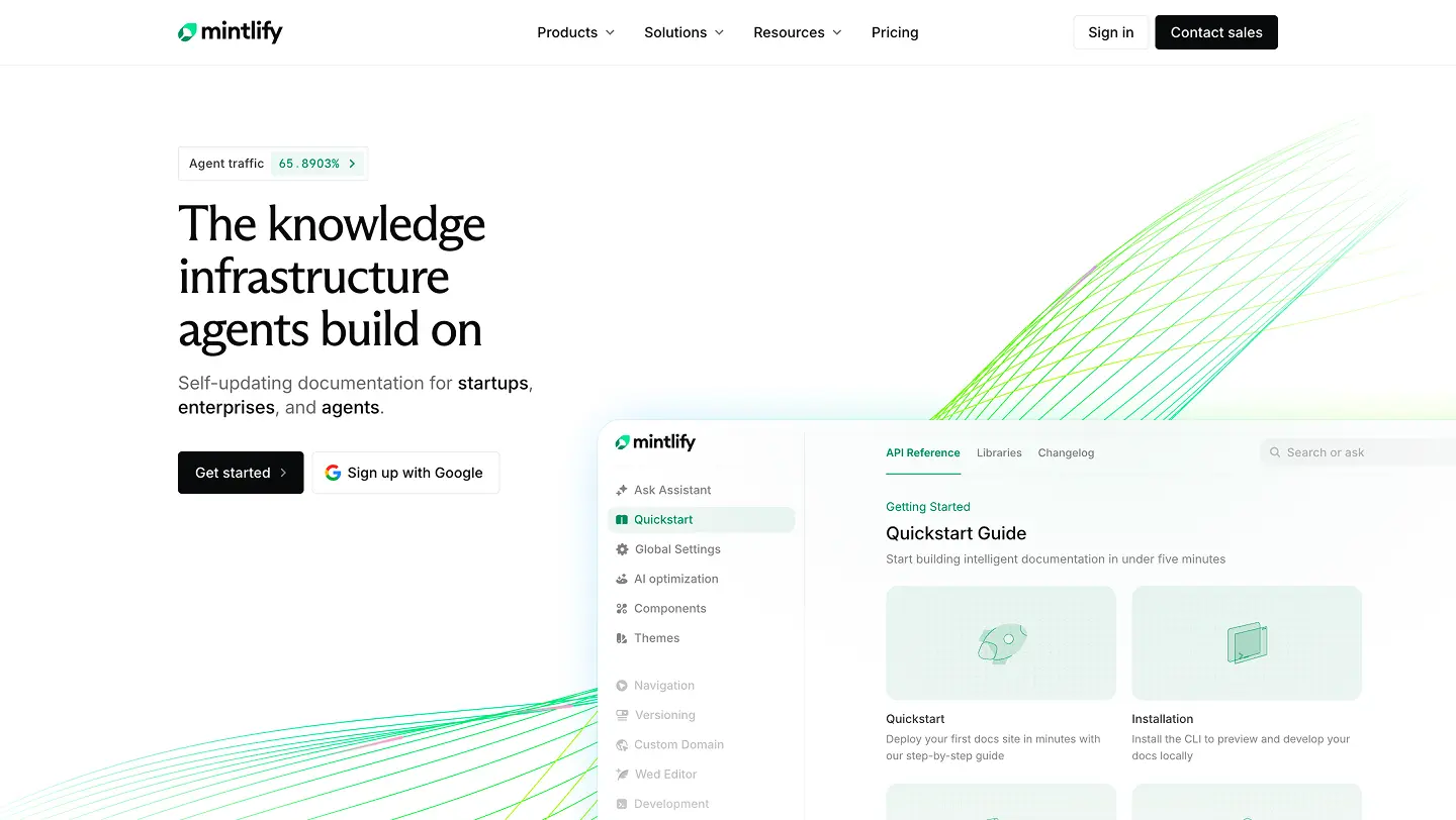
Visit website
Last updated 07/22/2026
# Mintlify Landing — Design System

The visual language for the Mintlify marketing site, serialized for designers,
developers, and agents. Every color below is a live CSS custom property in
`app/globals.css`, exposed as a Tailwind utility via `@theme inline` — reference the
token, never a raw literal.

## Colors

Every token resolves per theme. Light is the default; dark is class-based (`.dark`).
Values are listed light → dark; a single value means it's constant across themes.

### Surfaces & foreground

| Token (Tailwind)            | Role                | Light     | Dark      |
| --------------------------- | ------------------- | --------- | --------- |
| `bg-background-primary`     | Page background     | `#fefdfb` | `#0a0b0f` |
| `bg-background-secondary`   | Raised surface      | `#faf8f5` | `#121715` |
| `bg-background-tertiary`    | Inset / fill        | `#ebe9e6` | `#485450` |
| `text-foreground-primary`   | Primary text        | `#121715` | `#faf8f5` |
| `text-foreground-secondary` | Secondary text      | `#485450` | `#d9d7d4` |
| `text-foreground-tertiary`  | Tertiary text       | `#717d79` | `#cfcdca` |
| `text-foreground-muted`     | Muted / placeholder | `#969e9b` | `#969e9b` |

`*-invert` variants (`background-tertiary-invert`, `foreground-invert`) and the
`base-*` set (`base-default` / `base-invert` flip with the theme; `base-white` /
`base-black` are constant) provide theme-flipping absolutes for elements that must
invert. `*-transparent` tokens are the theme-correct transparent for gradients/fades.

### Borders

| Token                     | Role                     | Light       | Dark        |
| ------------------------- | ------------------------ | ----------- | ----------- |
| `border-border-line`      | Hairline / section rules | `#f1f0ee`   | `#1e1f21`   |
| `border-border-primary`   | Subtle border            | `#0000000a` | `#ffffff14` |
| `border-border-secondary` | Default border           | `#0000000f` | `#ffffff1a` |
| `border-border-tertiary`  | Stronger border          | `#00000014` | `#ffffff59` |
| `border-border-muted`     | Strongest border         | `#00000080` | `#ffffffb3` |

### Brand & status

Mintlify green **shifts hue across themes** — a deep green on light, a vivid mint on
dark — so always use the token, never a fixed hex.

| Token                               | Light                       | Dark                        |
| ----------------------------------- | --------------------------- | --------------------------- |
| `brand-base`                        | `#0c8c5e`                   | `#18e299`                   |
| `brand-vivid`                       | `#1fa77a`                   | `#1fa77a`                   |
| `brand-8` / `brand-10` / `brand-20` | base @ 8% / 10% / 20% alpha | same                        |
| `text-error` / `bg-error`           | `oklch(0.637 0.237 25.331)` | `oklch(0.704 0.191 22.216)` |

## Typography

Four families, each a CSS variable mapped to a Tailwind `font-*` utility:

| Utility      | Family            | Use                                    |
| ------------ | ----------------- | -------------------------------------- |
| `font-sans`  | Inter (variable)  | UI and prose — the default on `<body>` |
| `font-mono`  | Geist Mono        | Code, data, tabular figures            |
| `font-serif` | ABC Arizona Flare | Editorial display accents              |
| `font-paper` | Paper Mono        | Decorative mono / labels               |

`font-paper` runs its `ss03` "duospace" stylistic set by default for balanced `m`/`w`
proportions. Body sets `antialiased`, `optimizeLegibility`, and `font-synthesis: none`.
Headings get `text-balance`, paragraphs `text-pretty` (via `:where()`, so easily
overridden).

**Section headings** (the source-of-truth for new sections): `text-[1.75rem]/8
font-medium tracking-[-0.72px]` → `lg:text-[2.25rem]/[2.5rem]`, with an optional muted
subheading as `<span class="block text-foreground-tertiary">`.

## Layout

A token-driven responsive column grid (apply with the `grid-layout` /
`grid-layout-inner` utilities):

| Token              | Mobile | `md` (≥768px) | `lg` (≥1024px) |
| ------------------ | ------ | ------------- | -------------- |
| `--grid-columns`   | 4      | 12            | 24             |
| `--grid-gap`       | 16px   | 16px          | 16px           |
| `--grid-margin`    | 16px   | 16px          | 32px           |
| `--grid-max-width` | 1088px | 1088px        | 1088px         |

Content centers within `--grid-max-width`; the `bleed` utility breaks an element out to
full `100vw`. Section framing is attribute-driven: `data-rail` paints vertical edge
borders and `data-line` / `data-line-lg` paint a bottom hairline in `border-line`.
Content pages wrap in a bordered container (`max-w-[var(--grid-max-width)]` +
`border-x border-border-line`).

## Elevation & depth

Layered, low-opacity drop shadows — soft and diffuse rather than dark. Reference by
token (`shadow-*`): `shadow-button-sm`, `shadow-drop-sm` / `shadow-drop-md` (general
raised surfaces), `shadow-feature-card` (long, very soft), `shadow-navbar-bg` (sticky
navbar backdrop), `shadow-editor-tooltip` (directional floating tooltip).

## Motion

Motion clarifies change; it is not decoration. Use tokenized easings, keep durations
short, and **always honor `prefers-reduced-motion`** — every keyframe animation here is
disabled under reduce.

**Easing tokens:** `--ease-out-soft` `(.22,1,.36,1)`, `--ease-out-expo` `(.16,1,.3,1)`,
`--ease-in-out-smooth` `(.4,0,.2,1)`, `--ease-out-strong` `(.23,1,.32,1)`,
`--ease-in-out-strong` `(.77,0,.175,1)`. UI transitions land in the **150–250ms** band;
larger choreography (rail draw-on ~800ms) is the exception. Page scroll is smoothed via
Lenis.

## Shapes

No formal radius scale; radii are applied inline per component. Conventions in use:
`2px` for focus rings and inline badges, `4px` for buttons, `6px` for cards and media
(the standard card/image radius), `10px` for prose images, and `rounded-full` for
pills, dots, and spinners.

## Components

Shared primitives live in `components/ui` and compose the tokens above. The `Switch`
(`[data-slot='switch']`) is fully tokenized — hover, disabled, thumb shadow, and a
brand-tinted focus ring (`0 0 0 3.5px` of `brand-base` @ 20%). Cards use the
"stretched-link" pattern for accessibility: only the CTA is an `<a>` (the sole announced
link), with `after:absolute after:inset-0` making the whole card clickable. Build new
components the same way: variants via `class-variance-authority`, classes merged with
`cn` (`lib/utils.ts`), state surfaced through `data-*` attributes.

## Do's and don'ts

- **Do** reference the tokens above (`text-foreground-primary`), never raw hex or oklch
  literals, and don't introduce new color variables.
- **Do** rely on `dark:` variants and theme tokens; **don't** hard-code a brand hex — it
  changes between themes.
- **Do** give every interactive element a visible focus ring (`brand` outline, 2px,
  2px offset); **don't** remove outlines.
- **Do** draw an element's edge as a **semi-transparent inset ring** (`ring-1
ring-inset`, or an inset `box-shadow`) — **not** a `border` — whenever it also has a
  drop shadow. Reason: a `border` is opaque and paints on top, so the stroke and the
  shadow look like two separate flat layers. A translucent ring is itself a shadow
  layer, so it blends with the drop shadow — the two stack and go darker where they
  overlap, and the edge stays lighter where the shadow fades out. Result: one soft,
  dimensional edge instead of a hard line.
- **Do** gate every animation behind `prefers-reduced-motion`.
- **Do** keep UI transitions in the 150–250ms band with a tokenized easing; **don't**
  invent one-off cubic-beziers.
- **Do** use the grid utilities and `--grid-*` tokens for layout; **don't** hard-code
  column counts or page margins.