
Firecrawl
The genuine design.md file published by Firecrawl.
Visit website
Last updated 07/22/2026
#1: 4px
#2: 8px
#3: 12px
#4: 16px
#6: 24px
#sm: 8px
#md: 12px
#lg: 16px
# Firecrawl

## Overview

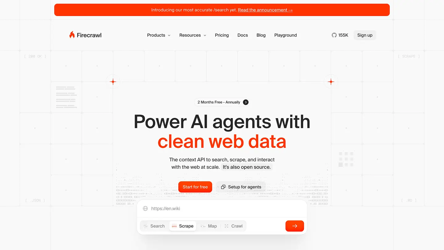
Firecrawl's design system builds clean, developer-focused interfaces for turning the web into LLM-ready data. The aesthetic is calm and high-contrast: content sits on near-neutral surfaces with generous whitespace, and a single signature color — heat orange (`#fa5d19`) — carries energy. Reserve heat for the most important action and brand moments; let the gray and alpha scales rank everything else. The system is happiest with restraint, then a flash of fire.

This document describes the Light theme. Firecrawl uses one set of semantic token names that redefine their values in the Dark theme, so the same `bg-surface` or `text-accent-black` works in both modes. Light values are the defaults above; Dark equivalents for surfaces, borders, and text are noted with a `-dark` suffix in the token list and in the sections below. Colors are sRGB hex; brand and accent colors also ship Display P3 variants for wide-gamut screens.

## Colors

### Heat (brand)

`heat-100` is `#fa5d19`, the one brand color. The rest of the heat scale is the same orange held at fixed opacities so it layers over any surface:

- `heat-4` / `heat-8` — subtle and hover backgrounds
- `heat-12` / `heat-16` / `heat-20` — active and selected backgrounds, faint borders
- `heat-40` / `heat-90` — emphasis fills and overlays
- `heat-100` — solid brand fill: primary buttons, active states, links, accent text

Use heat sparingly. One heat element per view usually reads as "the action"; more than that dilutes it.

### Semantic surfaces and text

Hierarchy comes from tonal surfaces and borders first, not color. Pick a surface by what an element _is_, not how it looks:

- `background-base` — the page/app background (`#f9f9f9` light, `#0a0a0a` dark). Use on `<body>`, `<main>`, and root containers.
- `background-lighter` — a slightly lifted base for nested sections (`#fbfbfb` light, `#141414` dark). For subtle separation only, not a general fill.
- `surface` — UI containers that sit _on top_ of the page: cards, modals, dropdowns, menus, sheets, popovers (`#ffffff` light, `#171717` dark).
- `surface-raised` — surfaces stacked _on top_ of other surfaces; identical to `surface` in light, slightly lifted (`#1f1f1f`) in dark for visible elevation.
- `accent-black` — primary text and icons; inverts between modes (`#262626` light, `#f5f5f5` dark).
- `accent-white` — text on colored fills (heat buttons, badges); stays `#ffffff` in both modes. Do not use it as a container background — use `surface`.

### Alpha scales

`black-alpha-*` (steps 1–88) are translucent neutrals that become white-alpha in Dark, so they layer over any background. Use them for borders, dividers, overlays, hover tints, and muted text. `white-alpha-56` / `white-alpha-72` cover the inverse. Reach for alpha tokens over solid grays when an element must read correctly on more than one surface.

### Borders and illustrations

`border-faint`, `border-muted`, and `border-loud` step from quiet to prominent (`#ededed` → `#e8e8e8` → `#e6e6e6` light; `#2a2a2a` → `#333333` → `#404040` dark). `border-muted` is the default. The `illustrations-*` scale (`faint`, `muted`, `default`) drives decorative fills, diagrams, and ASCII art that should invert with the theme.

### Accents

Accents carry meaning, not decoration: `accent-bluetron` (`#2a6dfb`) for links and info, `accent-crimson` (`#eb3424`) for errors and destructive actions, `accent-honey` (`#ecb730`) for warnings, `accent-forest` (`#42c366`) for success, and `accent-amethyst` (`#9061ff`) for special or premium features. Each is slightly brighter in Dark for visibility, and each ships a Display P3 variant.

## Typography

SuisseIntl sets all UI and prose. Geist Mono sets code, data, and tabular figures. Roboto Mono powers ASCII flame animations and decorative type. The tokens above carry concrete `fontFamily`, `fontSize`, `fontWeight`, `lineHeight`, and `letterSpacing`:

- **Titles** (`title-h1`–`title-h5`, plus `title-blog`) set pages and sections at weight 500; `letterSpacing` tightens as the size grows.
- **Labels** (`label-x-large`–`label-x-small`) are single-line, scannable text at weight 450: navigation, buttons, form labels, table headers, metadata.
- **Body** (`body-x-large`–`body-small`, plus `body-input`) sets multi-line prose and inputs at weight 400 with a taller line height.
- **Mono** (`mono-medium`, `mono-small`, `mono-x-small`) pairs Geist Mono with code, IDs, and numbers that need to align.

`body-medium` and `label-medium` (both 14px) cover most interface text. Apply the tokens rather than setting size, weight, or line height by hand, and keep to no more than two weights per view (typically 400 and 500).

## Layout

Spacing is pixel-based on a 4px rhythm: 4, 8, 12, 16, 24, 32, 40, 64, 96px. Keep a three-step cadence — 8px inside a group, 16px between groups, 32–40px between sections. Cards use 24px padding (16px when compact, 32px for hero areas).

> Note: Firecrawl's Tailwind config is pixel-based, so utilities like `p-8` mean 8px, `gap-16` means 16px, and `rounded-12` means 12px — roughly 4× smaller than default Tailwind. Always read spacing and radius values as literal pixels.

Center primary content in a ~1200px column with side padding that grows at wider breakpoints, and make every layout work on mobile and desktop. Breakpoints: `xs` 390px, `sm` 576px, `md` 768px, `lg` 996px, `xl` 1200px. Helper utilities (`center`, `center-x`, `center-y`, `flex-center`, `overlay`) and the `cw-`, `ch-`, `cs-`, `cmw-`, `mw-` families handle centering and centered max-widths.

## Elevation & Depth

Depth comes from tonal surfaces and borders first; shadows stay subtle, and in Dark mode `surface-raised` does the lifting instead of shadow. Use a `1px` `border-muted` (or `inside-border`, an inset border overlay that respects the radius) to separate a `surface` from the page. The primary heat button is the one place depth gets loud — a stacked, warm shadow gives it a physical, glowing press:

```css
box-shadow:
  inset 0 -6px 12px 0 rgba(255, 0, 0, 0.2),
  0 0.6px 0.8px 0 rgba(255, 139, 0, 0.22),
  0 1.3px 1.7px 0 rgba(255, 139, 0, 0.19),
  0 2.5px 3.1px 0 rgba(255, 139, 0, 0.16),
  0 4.4px 5.5px 0 rgba(255, 139, 0, 0.13),
  0 8.3px 10.3px 0 rgba(255, 139, 0, 0.1),
  0 2px 4px 0 rgba(250, 93, 25, 0.3);
```

Pair every elevation with the matching radius below.

## Motion

Motion clarifies change; it is never decoration. Most interactions use the standard transition `all 0.2s cubic-bezier(0.25, 0.1, 0.25, 1)`. Keep state changes around 150–200ms and overlays around 300ms. Press feedback is a tiny `scale(0.995)` on primary actions, `scale(0.98–0.99)` on smaller ones. ASCII flame animations (hero flames at ~85ms/frame, explosions at ~40ms/frame, background flames at ~80ms/frame) are a signature flourish — run them only when visible and pause them off-screen. Always honor `prefers-reduced-motion` by dropping nonessential and looping animation.

## Shapes

Radii stay tight and consistent: `8px` for everyday controls and surfaces (buttons, inputs, small cards), `12px` for cards, menus, and modals, `16px` for large or fullscreen surfaces. Reserve `999px` for pills, avatars, and circular controls. Keep one radius family per view rather than mixing rounded and sharp corners.

## Components

The `components` tokens above give ready-to-use values per element, drawn from this theme. All variants default to the medium (40px) size:

- **Primary button** — solid `heat-100` fill, `accent-white` label, and the warm stacked shadow above. The single most important action on a view.
- **Secondary button** — `black-alpha-4` fill with `accent-black` text; tints to `black-alpha-6` on hover, `black-alpha-7` on active.
- **Tertiary button** — transparent fill with `accent-black` text for low-emphasis actions; tints with `black-alpha-4` on hover.
- **Destructive button** — solid `accent-crimson` fill with white text for irreversible actions.
- **Input** — `surface` fill, `1px` `border-muted` border, `body-input` text, 8px radius.
- **Card** — `surface` fill, `1px` `border-muted` border, 12px radius, 24px padding.

Sizes: use `button-small` / `input-small` (32px) and `button-large` / `input-large` (48px); large buttons step up to `label-large`. Disabled states drop to ~50% opacity with a not-allowed cursor. Show a clear focus ring on every interactive element at `:focus-visible` — a 2px `heat-100` outline (or a two-layer ring of a 2px surface-colored gap then a 2px `heat-100` ring) — and never remove an outline without a visible replacement.

## Voice & Content

Copy is part of the design; keep it precise, technical, and free of filler.

- Use Title Case for labels, buttons, titles, and tabs; sentence case for body, helper text, and toasts.
- Name actions with a verb and a noun (`Start Crawl`, `Delete Key`), never `Confirm`, `OK`, or a bare verb.
- Write errors as what happened plus what to do next: `Crawl failed. The site blocked our request. Try enabling stealth mode.`
- Toasts name the specific thing that changed, drop the trailing period, and never say `successfully`: `API key deleted`, not `Successfully deleted the key.`
- Empty states point to the first action: `No crawls yet. Enter a URL to start one.`
- Use the present participle with an ellipsis for in-progress states: `Crawling…`, `Scraping…`.
- Use numerals (`3 credits`), curly quotes, and the ellipsis character; skip `please` and marketing superlatives.

## Do's and Don'ts

- Use the gray and alpha scales to rank information: `accent-black` for primary text, `black-alpha-64` for secondary, lower steps for muted.
- Keep heat for state and the single most important action on a view; one heat element per screen.
- Hold WCAG AA contrast (4.5:1 for body text); use `accent-white` (`#ffffff`) on `heat-100`.
- Show the focus ring on every interactive element at `:focus-visible`.
- Apply the typography tokens instead of setting font size, line height, or weight by hand.
- Don't signal state with color alone; pair it with an icon or text label.
- Don't use `background-lighter` as a general fill; it is for subtle separation only.
- Don't swap `surface` for `accent-white`, or `background-*` for `surface` — they are separate scales with different jobs.
- Don't mix rounded and sharp corners, or more than two font weights, in one view.