
Executor
The genuine design.md file published by Executor.
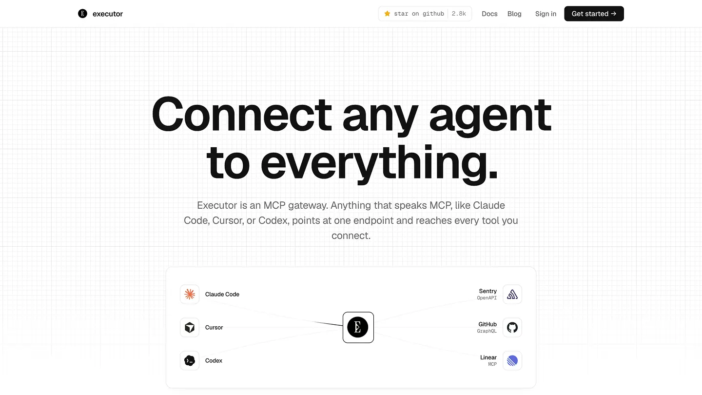
Visit website
Last updated 07/27/2026
#1: 4px
#2: 8px
#3: 12px
#4: 16px
#6: 24px
#sm: 5px
#md: 6px
#lg: 8px
# Executor

The integration layer for AI agents, drawn so the tool catalog is what stands out and the
chrome disappears. This file is the canonical, serialized design system: a human guide and an
agent-readable contract. It covers every surface, the app (console / local / cloud / desktop),
the marketing site, and the docs.

## Overview

Identity comes from restraint, not decoration:

- **One typeface family.** Geist for UI and prose, Geist Mono for everything machine: code,
  tool slugs, IDs, counts, keyboard shortcuts, section labels, and the wordmark. No serif.
- **Grayscale.** A near-neutral gray ramp carries all hierarchy through tone and hairline
  borders. There is no brand hue. The single allowed color is destructive red.
- **Hairlines over shadows.** Depth is a 1px border and a tonal step, not a drop shadow.
  Marketing frames its content column with full-height hairline guides.
- **Authentic marks, not an icon pack.** Brand marks are real favicons (app) or real brand
  SVGs (marketing). Generic UI affordances are hand-drawn. A uniform icon set in rounded gray
  squares reads as generated; we do not use one.
- **Mono is the voice of metadata.** If it is a label, a count, an ID, a shortcut, or an
  index, it is Geist Mono, uppercase and tracked when it labels a section.

The same restraint applies to copy: it is part of the design (see Voice and content).

## Where it lives (sources of truth)

| Surface                              | Tokens / styles                                                   | Notes                                                             |
| ------------------------------------ | ----------------------------------------------------------------- | ----------------------------------------------------------------- |
| App (console, local, cloud, desktop) | `packages/react/src/styles/globals.css`                           | shadcn semantic tokens via Tailwind `@theme inline`; Light + Dark |
| Marketing                            | `apps/marketing/src/styles/global.css`                            | `--color-*` tokens; Light only                                    |
| Docs                                 | `apps/docs/docs.json` (colors) + `apps/docs/style.css` (wordmark) | Mintlify theme                                                    |

The CSS is the runtime source of truth; this file is its serialization. Keep them in sync.

**Fonts** are loaded from Google Fonts where each surface boots: `apps/marketing/src/layouts/Layout.astro`,
`apps/cloud/src/routes/__root.tsx`, `apps/host-selfhost/web/index.html`,
`apps/host-cloudflare/web/index.html` (Geist + Geist Mono), and `apps/docs/style.css` (Geist Mono,
for the wordmark). The desktop renderer self-loads nothing and inherits the stacks from the app
CSS. Stacks: `--font-sans: "Geist", ui-sans-serif, system-ui, sans-serif`;
`--font-mono: "Geist Mono", ui-monospace, "SF Mono", Menlo, monospace`. `--font-display` and the
marketing `--font-serif` both resolve to Geist (there is no serif).

## Two token vocabularies

The app and marketing express the same ramp under different names. Use the app's shadcn
semantic names in product code; use the `--color-*` names in marketing. They map one to one:

| Role                          | App token             | Light     | Marketing token         | Light     |
| ----------------------------- | --------------------- | --------- | ----------------------- | --------- |
| Page background               | `background`          | `#ffffff` | `surface`               | `#ffffff` |
| Quiet fill / hover tint       | `secondary` / `muted` | `#fafafa` | `surface-2`             | `#fafafa` |
| Primary text                  | `foreground`          | `#111111` | `ink`                   | `#111111` |
| Secondary text, metadata      | `muted-foreground`    | `#666666` | `ink-2`                 | `#666666` |
| Tertiary text, eyebrows       | `ring` (closest)      | `#888888` | `ink-3`                 | `#888888` |
| Hairline border               | `border`              | `#eaeaea` | `rule`                  | `#eaeaea` |
| Field / heavy stroke          | `input`               | `#d4d4d4` | `rule-strong`           | `#d4d4d4` |
| Primary CTA fill (near-black) | `primary`             | `#0a0a0a` | `accent`                | `#0a0a0a` |
| Primary CTA text              | `primary-foreground`  | `#ffffff` | `surface`               | `#ffffff` |
| Destructive / error           | `destructive`         | `#b4261a` | (not used in marketing) |           |

The app additionally carries `card` / `popover` (stacked surfaces), `accent` (`#f5f5f5`, hover
or selected surface), and the `sidebar-*` family for app chrome. Marketing is Light only; the
app inverts every token in Dark (values inline in the frontmatter).

## Colors

Pick a surface by what an element is, not how it looks:

- `background` / `surface` is the page and app root. `card` and `popover` are containers on top
  of it (cards, dialogs, dropdowns, menus); in Dark, `popover` lifts one step above `card`.
- `sidebar` is the persistent chrome, one shade off `background`, with its own border and
  `sidebar-active` for the selected nav item.
- `secondary` / `muted` / `accent` are quiet fills and hover or selected states, not page
  backgrounds.
- `foreground` / `ink` is primary text and icons; `muted-foreground` / `ink-2` is secondary
  text and metadata; `ink-3` is tertiary text and eyebrows.

Rank information with tone: primary text at `foreground`, secondary at `muted-foreground`,
separation with `border`. `primary` is a near-black solid (white in Dark) used only for the
single most important action on a view. `destructive` is the one hue; pair it with text or an
icon, never signal state with color alone.

### Color exceptions (illustration only)

Two marketing demos use muted secondary hues, confined to illustration and never used as UI or
semantic tokens. They are the only color outside destructive red:

- **Code window syntax** (`.tok-*` in `global.css`): keyword `#8250df`, string `#2f7d52`,
  number `#b4690e`. Comments, functions, and punctuation stay grayscale.
- **Connection matrix status dots**: ok `#2f9e6f`, warn `#d9883a`.

Treat these as the documented exception, not license to add hues elsewhere. (Open question:
whether even these should go grayscale; if so, syntax highlighting drops to ink + one muted
tone and the status dots become `foreground` / `muted-foreground`.)

## Typography

Geist sets all UI and prose; Geist Mono sets everything machine. Keep to no more than two
weights per view (400 and 500, 600 for headings), and apply the type tokens rather than setting
size, weight, or line height by hand.

The **mono metadata system** is the system's voice. Geist Mono, usually uppercase and tracked,
is used for:

- the wordmark `executor` (always Geist Mono);
- section eyebrows / labels (`.eyebrow`: 12px, uppercase, `0.18em`, `ink-3`; the app `sec-label`
  token: 11px, uppercase, `0.08em`, `muted-foreground`);
- index numerals on feature grids (`.cap-num`: 11px, `0.08em`, `ink-3`, values `01`-`06`);
- counts, durations, IDs, tool slugs (`github.search_issues`), and keyboard shortcuts.

Headings are Geist 600 with tight tracking (down to `-0.04em` at display sizes). Marketing
`.section-title` is `clamp(2rem, 4.2vw, 3rem)`; the hero headline goes to
`clamp(2.8rem, 7.2vw, 6rem)`. Body and `label` (13-16px) cover most interface text. Site-wide
tracking is slightly tight (`-0.011em`).

## Layout

Spacing follows a 4px rhythm: 4, 8, 12, 16, 24, 32, 40px. Keep a three-step cadence: 8px inside
a group, 16px between groups, 32 to 40px between sections.

**Marketing** centers content in fixed columns and separates sections with `border-t border-rule`
plus `py-14`/`py-20`/`py-28`:

| Region                       | Max width |
| ---------------------------- | --------- |
| Nav, footer                  | 1200px    |
| Feature / pricing sections   | 1100px    |
| Hero                         | 920px     |
| Connection-diagram card, FAQ | 760px     |
| Founder note                 | 680px     |

The signature **frame guides** are full-height 1px hairlines at the content-column edges
(implemented in the app preview; on the marketing site the column edges are implied by the
section borders and the centered max-widths). The hero sits on a faint grayscale graph-paper
texture (see Signature patterns).

**App** is a fixed sidebar plus a scrolling main pane. Every view works from the 768px
breakpoint up (the desktop window minimum).

## Elevation and depth

Depth comes from tonal surfaces and hairlines first. Separate a `card` from the page with a 1px
`border` and at most a soft shadow. Floating surfaces (menus, dialogs) may add one diffuse
shadow. In Dark, lift with a one-step-lighter surface (`card` to `popover`) rather than a heavier
shadow. Pair every elevation with the matching radius.

## Motion

Motion clarifies a change; it is never decoration. Most interactions should feel instant, and
`0ms` is often right. When motion helps, keep it short and tokenized: about 150ms for state
changes, 200ms for popovers and tooltips, 300ms for overlays. Press feedback is a small
`scale(0.99)` on primary actions. Marketing uses a restrained set of scroll reveals
(`cubic-bezier(0.22, 1, 0.36, 1)`, staggered) and the connection-diagram beam travels on a 4s
loop. Always honor `prefers-reduced-motion`.

## Shapes

Radii stay tight. App: 5px inline controls, 6px buttons and inputs, 8px cards and menus, 11px
large or overlay surfaces, `9999px` for pills, avatars, and dots. Marketing rounds a little
softer on large surfaces (cards and code windows at 14px, the feature grid at 16px) but holds
the same family per view. Do not mix rounded and sharp corners.

## Components

### App (`packages/react/src/components`)

Built with `class-variance-authority` for variants, classes merged with `cn`, state surfaced on
`data-*` attributes (`data-slot`, `data-variant`, `data-size`, and Radix `data-state`). Every
interactive element shows a focus ring at `:focus-visible`
(`focus-visible:ring-[3px] focus-visible:ring-ring/50`); disabled drops to `opacity-50`.

- **Button** (`button.tsx`): variants `default` (primary fill), `secondary`, `outline`, `ghost`,
  `destructive`, `link`. Sizes `xs` / `sm` / `default` (h-9) / `lg`, plus `icon{,-xs,-sm,-lg}`.
  Leading icons auto-size to `size-4`.
- **Badge** (`badge.tsx`): `rounded-full`, `px-2 py-0.5 text-xs`; variants mirror Button. Use
  sparingly; prefer a mono label where a status word will do.
- **Input / Textarea** (`input.tsx`, `textarea.tsx`): `h-9`, `rounded-md`, 1px `input` border,
  `bg-transparent` (dark `input/30`); textarea is `field-sizing-content`.
- **Select** (`select.tsx`): Radix; trigger sizes `default` / `sm`; content on `popover`.
- **Switch / Checkbox / RadioGroup**: Radix; checked state fills with `primary`; checkbox uses a
  lucide `CheckIcon`, radio a filled `CircleIcon`. (These ticks are the sanctioned functional
  icon use, see Marks and icons.)
- **Tabs** (`tabs.tsx`): `default` (pill list on `muted`) and `line` (2px `foreground` underline
  on the active tab). Mono labels.
- **Card / CardStack** (`card.tsx`, `card-stack.tsx`): `card` fill, 1px `border`, `rounded-xl`.
  CardStack is the app's dense bordered-row list (collapsible, searchable), the right pattern for
  catalogs over rounded-rect card grids.

The frontmatter `components` block gives ready-to-use recipes (button-primary / secondary /
ghost / danger, input, chip, card) at the system's default 32px control height.

### Marketing (`apps/marketing/src/styles/global.css`)

- **`.btn-primary`**: `ink` fill, `surface` text, 8px radius (the `--hero` modifier bumps
  padding and size).
- **`.surface-card`**: white, 1px `rule`, 14px radius, one soft diffuse shadow.
- **`.eyebrow` / `.section-title` / `.section-sub`**: the section header trio (mono eyebrow,
  Geist 600 title, `ink-2` sub).
- **`.cap-grid` / `.cap-card` / `.cap-num`**: the feature grid. Hairline separators come from a
  1px gap over a `rule` background; each cell leads with a mono index numeral, then a Geist 600
  title and `ink-2` body. `.cap-card--soon` dims a cell and adds a plain mono `.cap-soon-badge`.
- **`.code-window`**: a framed code sample with a hairline titlebar, gray "traffic light" dots
  (all `rule-strong`, not colored), a mono filename, and the `.tok-*` syntax classes.
- **`.trace` waterfall**: mono rows with a pill rail (`surface-2`) and an `accent` bar; the root
  span darkens to `ink`. Used inside the "Trace every call" card.

## Signature patterns

- **Frame guides** / centered hairline column: the registry-grade framing device.
- **Graph-paper hero texture**: an ink-masked grid at `opacity: 0.08`, faded into the surface
  toward the bottom. Grayscale, subtle, never colored.
- **Connection diagram** (`animated-beam-demo.tsx`): agents to a central Executor hub to tools,
  drawn with real brand SVGs and grayscale animated beams (the live page uses the `stripe`
  variant: `#111` beam, `rule` paths). Brand marks, not icons.
- **Mono index numerals** (`01`-`06`) instead of icon chips on feature grids.
- **Install / agent pill**: a copyable mono command chip in the hero CTA.
- **Works-with row** and the catalog preview: real brand marks plus mono protocol sub-labels
  (`OpenAPI`, `GraphQL`, `MCP`, `CLI`) and kind chips.

## Marks and icons

Do not use a uniform icon pack (Tabler, Lucide-as-decoration, Heroicons) or
monogram-in-rounded-square placeholders: both read as generic, generated UI. Identity comes from
authentic specifics or from nothing at all.

- **App**: integration and brand marks use the real favicon service,
  `https://www.google.com/s2/favicons?domain={host}&sz={n}` (`integration-favicon.tsx`, rendered
  2x for retina), with Executor's own `/favicon-32.png` for the built-in integration. The only
  lucide import there is `BoxIcon` as a neutral fallback when a favicon fails to load.
- **Marketing**: brand marks are local SVGs in `apps/marketing/src/assets/logos` (`github.svg`,
  `stripe.svg`, `linear.svg`, `claude.svg`, ...); the hub uses `/favicon-192.png`.
- **Generic UI affordances** (select chevron, checkbox tick): hand-drawn in CSS or a small inline
  SVG, or a single functional lucide glyph (`CheckIcon`, `CircleIcon`, `ChevronRight`). These are
  functional, not decorative, and are the sanctioned exception.
- Where a mark would only add noise, use none: type, a status dot, and mono metadata carry it.

## Status and semantics

State reads through grayscale tokens plus an icon or text label, never color alone. Destructive
red is the one retained hue (errors, irreversible actions). Success, warning, pending, and
connected states use grayscale: `foreground` for the affirmative or active, `muted-foreground`
for the quieter or pending, paired with their existing word ("Verified", "Pending", "Canceling")
or a dot. (The marketing demo dots and code syntax are the documented illustration exception
above.)

## Voice and content

Copy is part of the design; keep it precise, technical, and free of filler.

- Title Case for labels, buttons, titles, and tabs; sentence case for body, helper text, toasts.
- Name actions with a verb and a noun (`Add Integration`, `Connect Agent`, `Revoke Token`), never
  `Confirm`, `OK`, or a bare verb.
- Errors are what happened plus what to do next: `Couldn't reach the integration. Check the server is
running, then retry.`
- Toasts name the specific thing that changed, drop the trailing period, never say
  `successfully`: `Integration added`, not `Successfully added the integration.`
- Empty states point to the first action: `No integrations yet. Add one to start sharing tools across
your agents.`
- Present participle with an ellipsis for in-progress states: `Connecting...`, `Syncing...`.
- Use numerals (`3 tools`); skip `please` and marketing superlatives (powerful, seamless, robust,
  leverage, unlock, game-changing).

## For agents

Executor serves AI agents, so its own interface follows agent-friendly rules:

- The token values are the contract. Read a token; do not hardcode a hex literal or a raw size.
- No brand hue. If a design seems to need "another color," it is a role token at a different
  step, not a new hue.
- State lives on `data-*` attributes and semantic tokens, so a component can be reasoned about
  without parsing class soup.
- This file is the serialized system. Keep it in sync with the CSS sources listed above.

## Do's and Don'ts

- Rank information with the gray ramp and hairlines, not color.
- Keep the near-black `primary` for the single most important action; one per view.
- Hold WCAG AA contrast (4.5:1 for body text).
- Apply the typography tokens instead of setting size, line height, or weight by hand.
- Use Geist Mono for the wordmark, section labels, counts, slugs, shortcuts, and index numerals.
- Don't introduce a brand hue or a second accent; extend the neutral and semantic scales instead.
- Don't use an icon pack or monogram placeholders; use real favicons or brand SVGs, or nothing.
- Don't use `card` / `popover` as a page background, or `muted` / `accent` as a general fill.
- Don't mix rounded and sharp corners, or more than two font weights, in one view.